Webinars stand out as powerful tools for both knowledge-sharing and brand promotion.
But how do you transform a passive viewer into an active participant eager to take the next step?
The answer lies in crafting the perfect Call to Action (CTA).
With a compelling webinar CTA, you can increase engagement and drive participants to meaningful action.
This guide provides a blueprint for creating effective webinar CTAs that maximize the true potential of your online events.
Why You Need a Good Webinar CTA

Engaging your audience is the cornerstone of any successful webinar.
However, in a saturated online environment where the average person is exposed to over 5,000 ads and marketing messages daily, presenting quality content alone might not guarantee high engagement.
And beyond sharing information, a webinar’s ultimate goal is getting participants to take action.
This includes signing up for a future event, downloading a resource, or joining a community (which aren’t always easy to achieve).
Here’s where a strong CTA comes into play.
Driving Action
The CTA is a critical bridge between your webinar content and the desired outcome. It’s based on understanding the needs and goals of your audience.
By the end of your webinar, attendees should feel like they’ve learned something incredible and want more!
Guiding attendees towards a specific action isn’t just beneficial for your metrics – it provides them with genuine value.
It says, “If you found this useful, here’s your next step to apply what you’ve learned.”
Without a CTA, even the most engaged webinar attendees might wonder, “Now what?”
Your role is to offer them the answer. Their journey with your content should be both informative and actionable.
Building Relationships
Cultivating relationships is about trust.
Webinar attendees are more likely to engage, share feedback, or even become brand ambassadors when they feel a genuine connection.

That said, your interaction shouldn’t end after the event.
There should be continuous dialogue between you and your audience.
A strong CTA can help with this. You can invite attendees to join a community, participate in follow-up sessions, or schedule one-on-one discussions.
You can even reinforce that CTA when sending your webinar replay emails.
Think of it this way:
While the webinar content establishes the initial connection and your credibility, the CTA anchors the relationship so it grows and evolves.
Data Collection
Every interaction, from a simple click to a chat, is a valuable data point that helps refine and improve your webinar strategies.
Your CTAs work in the same way.
Monitoring which CTAs have the highest conversion rates will enable you to update other CTAs accordingly,
Analyzing CTA performance can pinpoint the offers your audience finds most relevant.
By strategically applying your CTAs throughout the webinar, you’re not just presenting a request. You’re offering real value.
Techniques for Creating Effective Webinar CTAs
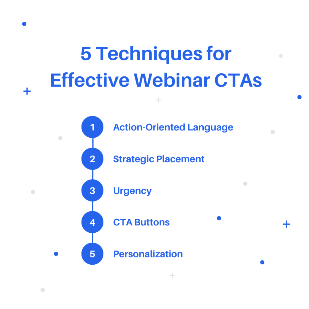
You might have gotten people to attend your webinar, but getting them to do something during the live event is another challenge.
A well-structured CTA can be the deciding factor in converting those attendees.
So before you plug your CTA into your webinar automation platform, keep these webinar CTA techniques in mind:
Use Simple and Action-Oriented Language
Clear and concise language is key for effective CTAs. Avoid jargon and overly complex phrases.
This helps your audience know exactly what action they’re being prompted to take.
Plus, your message won’t get lost in translation if you have audience members who aren’t overly familiar with the webinar topic.
Even a single CTA written in plain and simple language can increase click-through rates by up to 371%.
For example, a direct “Register Now” typically outperforms a more ambiguous “Proceed to Next Stage.”
The verbs you choose matter as well. Opt for actionable terms like “Download,” “Start,” or “Join,” to make the intended action clear.
Words like this spark momentum and persuade attendees to make a decision. They’ll instinctively know to take a step in exchange for something valuable.
Place CTAs Strategically
Your CTA should be placed where it naturally fits into the flow of the content and is visually prominent.
While Nielsen Norman Group’s research emphasizes the ‘F’ pattern where users scan web pages, webinars are a dynamic medium. Users’ attention can fluctuate based on content quality, pacing, and visuals.
But the principle remains:
Your audience pays the most attention to the areas they first see.
For instance, the beginning of a webinar often captures peak attention. This is when viewers are settling in and are most receptive.
Introducing a soft CTA that doesn’t require much commitment or investment early on can cater to those with a shorter attention span.
Meanwhile, placing a more pronounced CTA that requires a higher commitment at the conclusion capitalizes on the momentum built during the session.
Those who have stayed until the end are likely more invested in taking desired actions.
Mid-webinar CTAs can also be effective, especially when they tie directly into the content being discussed.
For example, if you have a related resource about a topic, a CTA prompting users to download that resource can be introduced right at that moment.
Tip: A webinar automation platform can help with CTA positioning. Features like CTA pop-up actions, highlighted chat messages, or visual markers could make your CTAs more noticeable.
Create a Sense of Urgency
Urgency prompts action.
It capitalizes on a basic human instinct. We don’t want to miss valuable opportunities, especially temporary ones.
For example, when promoting a special post-webinar resource or a limited-time discount, phrases like “Available Today Only” or “Exclusive Access for First 50 Attendees” can make your offer appear more attractive.
It subtly communicates that hesitation might result in missing out on exclusive content.
Another effective method is coupling your CTA with a real-time countdown timer during the webinar. This can visually represent the offer’s limit.
If you’re running a discount on a product or service you’re discussing, showing a countdown next to the CTA button can prompt quicker decisions.
But while urgency can be a powerful tool, it’s important to use it sparingly. Overuse or creating false urgency can lead to mistrust.
If attendees feel constantly pushed, your CTA can have the opposite effect.
Highlight Your CTA Buttons
Buttons are easier to click compared to text links. They’re visual and are perceived as actionable elements.
To get your audience to notice your CTA button on their screens, contrast it with the background color of your webinar slide or landing page,
If you have a dark background, opt for a light-colored button and vice versa. Using a red CTA button is also more effective than using green.
While the button shouldn’t dominate the screen, it should be large enough to be easily clickable, especially for mobile users.
Rounded edges can also make them look more approachable and click-friendly.
Most importantly, surround the CTA button with enough space. Clutter like extra text or images might push it further from your audience’s attention.
Include Multiple Targeted CTAs
Webinar attendees aren’t a uniform group. They come with varied levels of expertise, goals, and expectations.
Recognize this diversity and personalize your webinar CTAs accordingly.
Consider the attendee who’s just getting started in a field versus another who’s looking for advanced techniques.
Their needs are different. And a single CTA might not appeal to both.
For example, in a webinar on digital marketing, a novice might be overwhelmed by in-depth discussions about SEO algorithms or pay-per-click strategies.
For them, a CTA offering a “Beginner’s Guide to Digital Marketing” could be perfect.
On the other hand, a seasoned digital marketer might be searching for cutting-edge strategies to enhance their existing campaigns.
A CTA promoting an “Advanced Digital Marketing Masterclass” would be more up their alley.
The beauty of webinars is that they can be interactive and adaptable.
Before writing your CTA copy, use polls or quick surveys in your webinar reminder emails to gauge your audience’s experience level.
With this kind of personalization, you need to make sure your CTAs aren’t competing with each other on the same slide or screen.
Space them out during your presentation to avoid confusing your audience.
5 Webinar CTA Examples
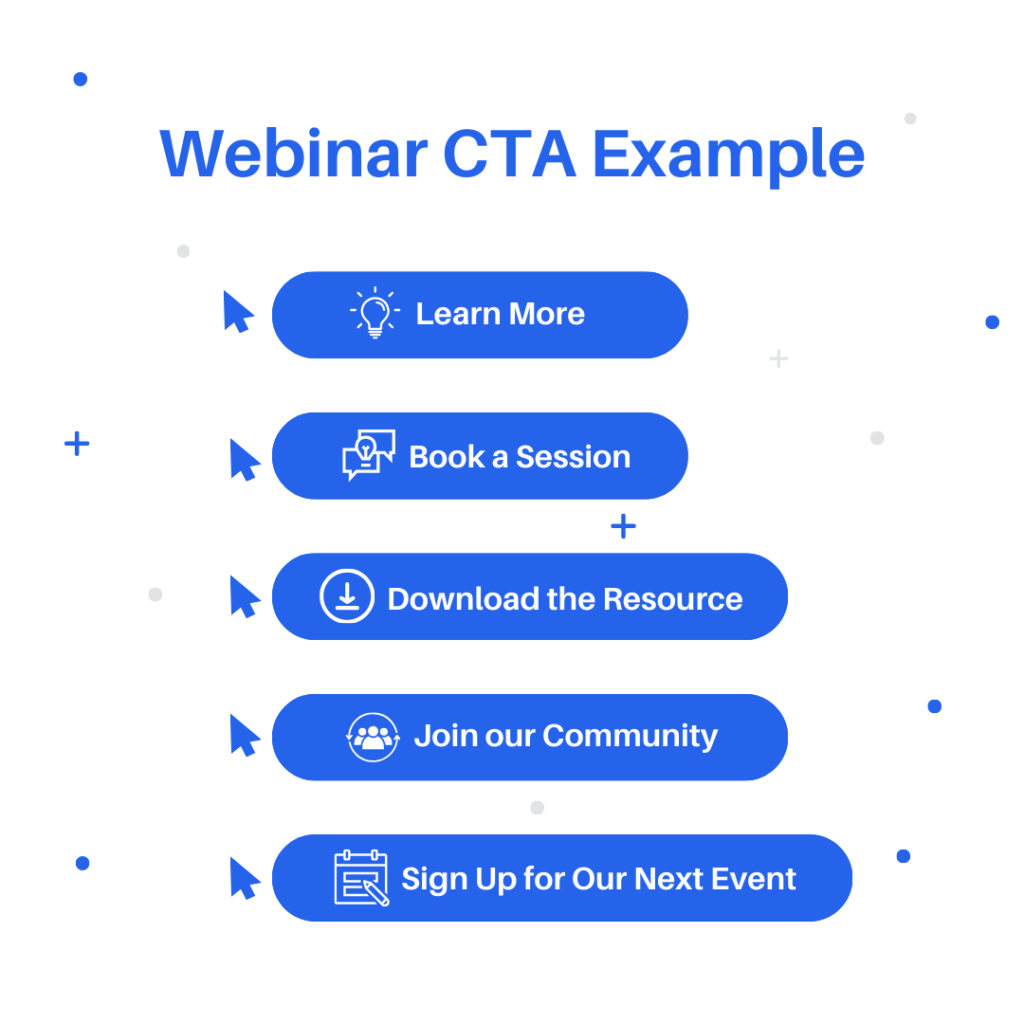
As mentioned, webinar CTAs have different functions and elements.
To figure out what type of CTA can work best for your online event, let’s take a look at some examples:
"Learn More"
Termed a “soft prompt,” the “Learn More” CTA gently nudges without being too forceful.
It’s perfect for attendees in the initial stages of their journey with your content.
By offering additional insights about the webinar topic, you can cater to those who aren’t ready to commit but are curious to explore further.
It’s a way to delve deeper without the pressure of an immediate decision.
"Book a Session"
Unlike a soft prompt, “Book a Session” is a more direct and instructional CTA. It typically signals a higher level of engagement.
When attendees opt to “Book a Session,” they are interested in your main product or service. Maybe through a personalized consultation or a specialized training session.
It’s an excellent option when you’ve introduced a broad topic during the webinar and now offer attendees a more detailed option.
"Download the Resource"
For content-rich webinars, a CTA labeled “Download the Resource” is great for a bonus or add-on.
It’s an invitation for attendees to take a piece of the webinar home, whether in the form of a template, checklist, or e-book.
This tangible offer serves as a lasting reminder of the value you provide.
It also encourages attendees to engage with your content after the webinar ends and ultimately brings them one step closer to converting.
"Join Our Community"
The “Join Our Community” CTA encourages attendees to become part of your immediate audience.
Your community could be a dedicated Facebook group or a members-only platform.
Beyond growing your client base, you’re nurturing a network of engaged individuals who can share their insights and experiences with your brand.
"Sign Up for Our Next Event"
If you’re a regular webinar host or your business has a series of events lined up, this CTA seamlessly links one event to the next.
It sustains and continues the engagement with your audience.
Instead of leaving it to chance for attendees to discover your next event, this proactive nudge fosters ongoing interaction.
And it’s a great way to enrich the attendee experience.
Let AEvent Help You with Your Webinar CTAs
Crafting the perfect CTA is crucial to maximizing your webinar’s potential.
It’s about merging the art of persuasion with the strategic placement of actionable instructions.
As you refine your webinar strategies, always consider the attendee’s perspective.
What’s the next step they should take after your webinar? How can you guide them there seamlessly?
But even the most compelling CTA requires the right platform to shine.
AEvent offers webinar automation features to streamline online events and make your CTAs take center stage.
Why not experience the AEvent difference for yourself? Schedule a demo today!


